
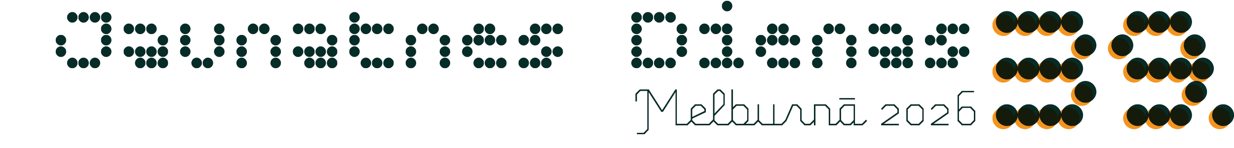
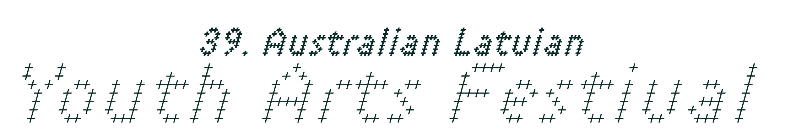


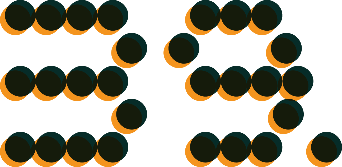
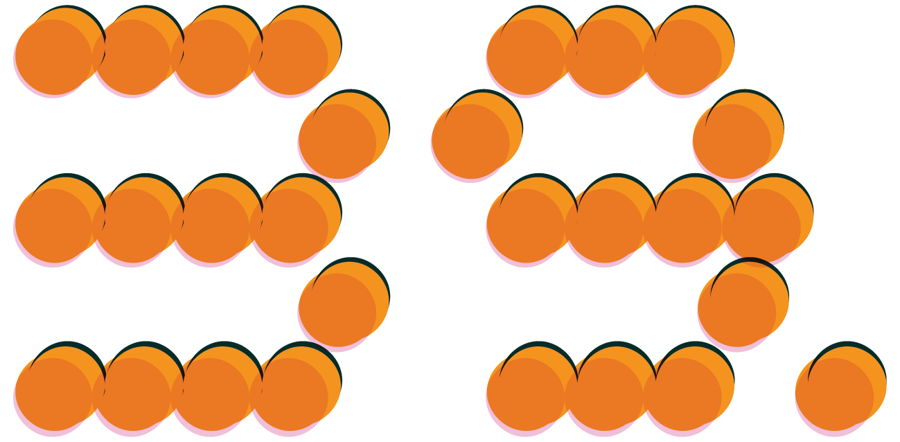
Australian Latvian Youth Arts Festival 39JDs in Melbourne
A visual identity inspired by the natural rhythm of the day.
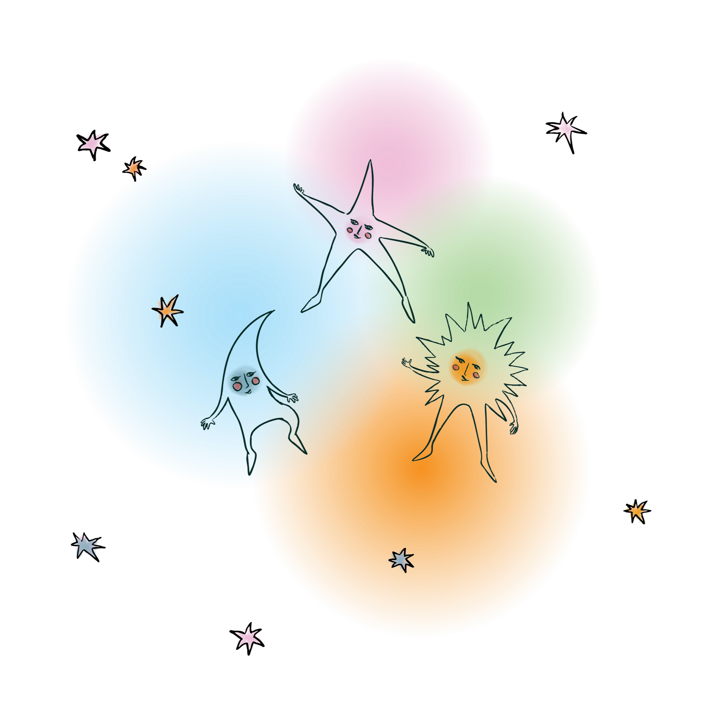
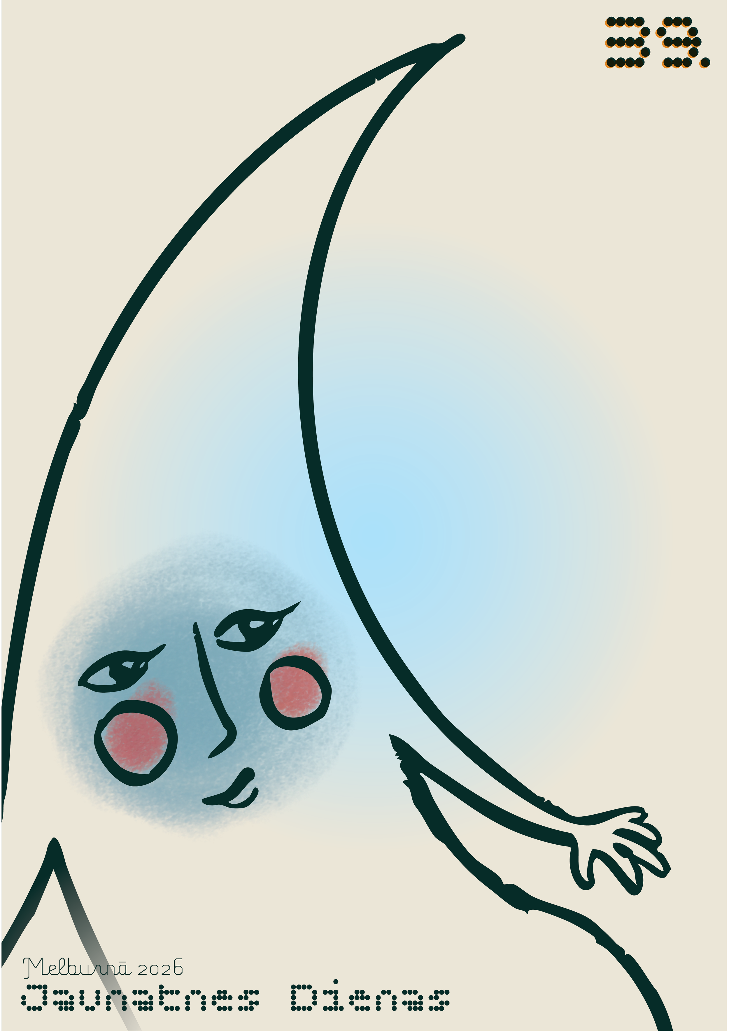
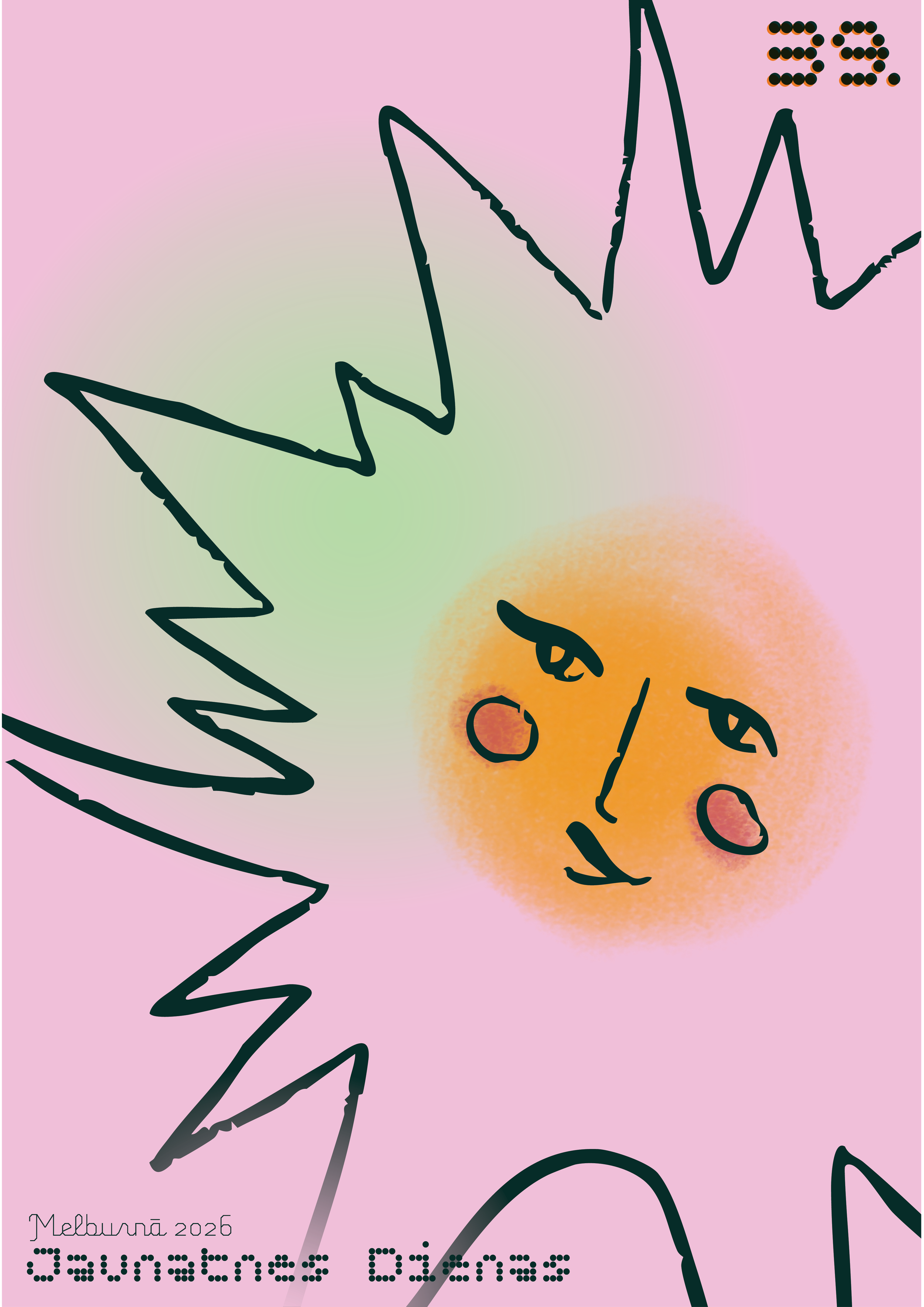
Dawn, day, dusk, twilight, and night. Brought to life through playful characters, glowing gradients, alongside a fusion of Latvian heritage and contemporary elements - introducing the look for 39. Jaunatnes Dienas, Melbourne / 39th Australian Latvian Youth Arts Festival in Melbourne.
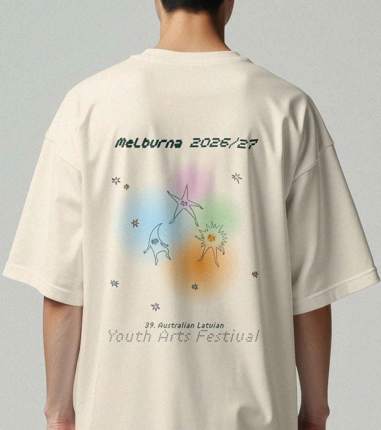
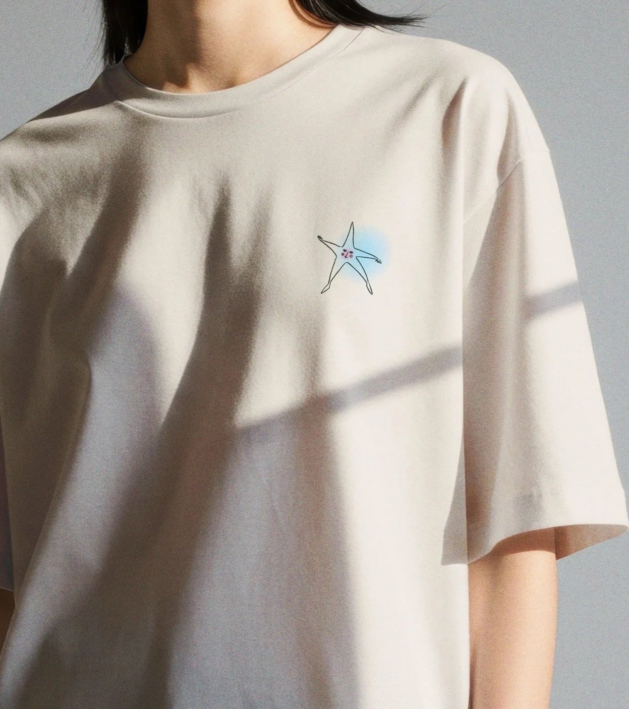
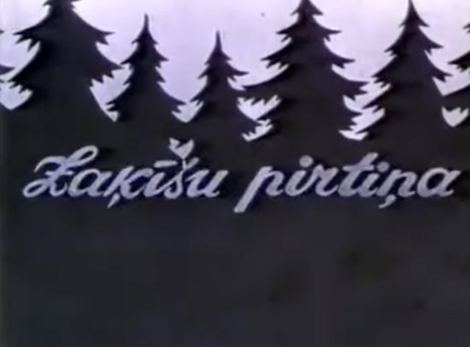
The brief centred on honouring Latvian origins, and my own personal reference to my youth as a Latvian. The illustrated characters were inspired by the whimsical, expressive style of Livia Fălcaru, the charm and simplicity of classic Latvian animation such as Zaķīšu Pirtiņa, and the long-standing folklore tradition of personifying elements of nature. These influences shaped the star, moon, and sun figures, giving the festival a familiar yet youthful personality.
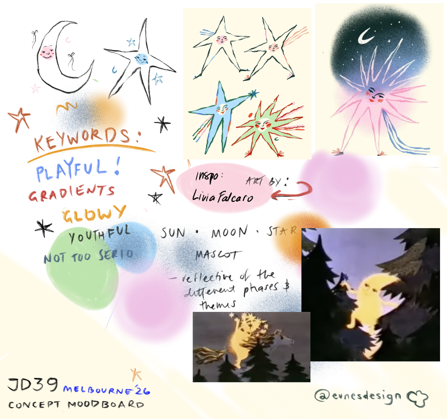
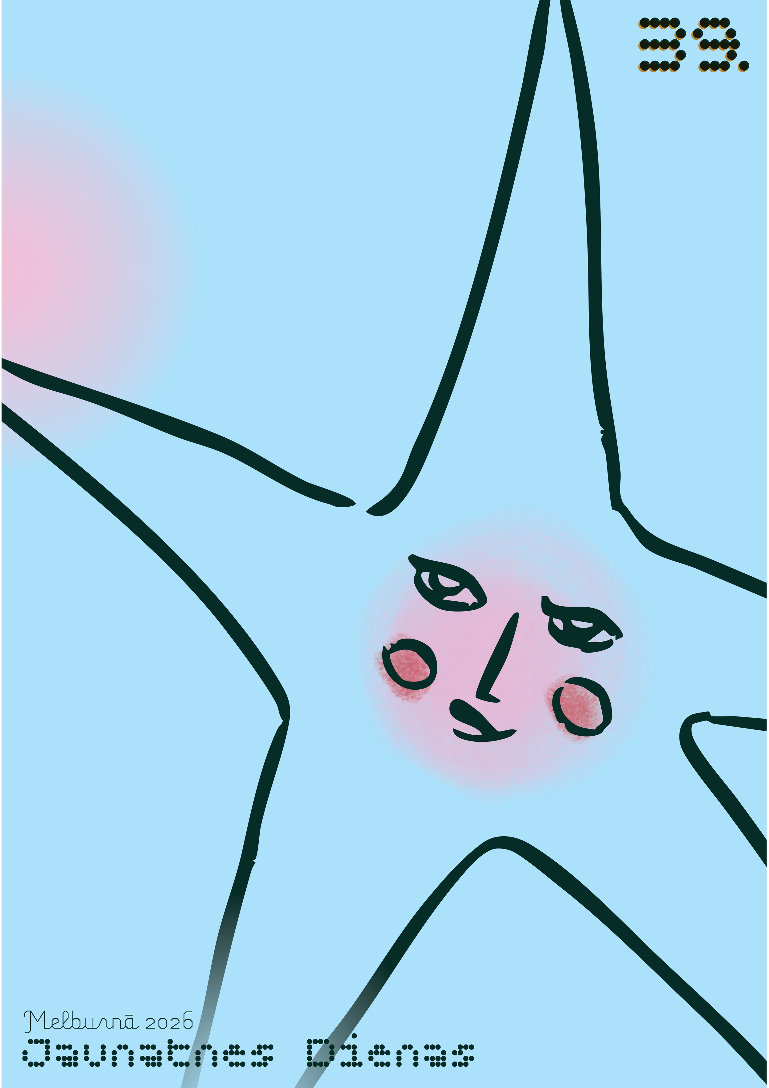
The characters were designed with a hand drawn style to reflect qualities often associated with childhood creativity and the freedom of youth. Their bodies stretch, bend, and float, with shapes and natural line work, that reflects the nature symbolism behind the design.
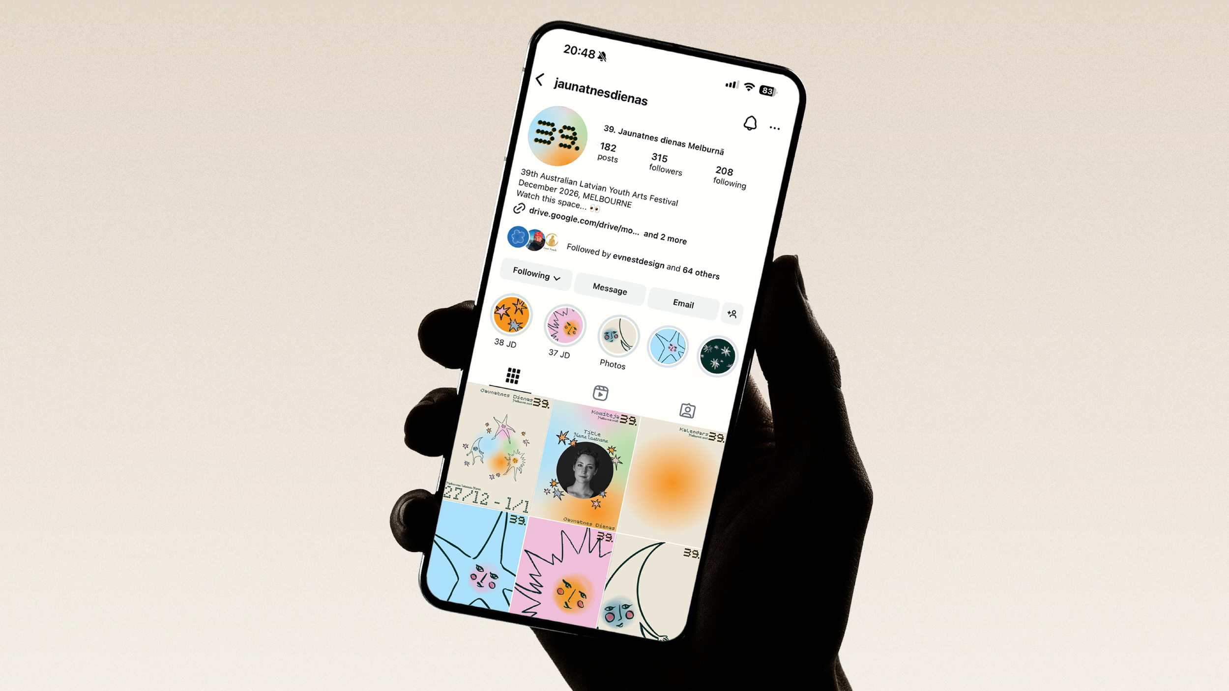
The identity was developed to extend beyond print and digital, with the physical festival spatial design in mind. The glowing gradients and celestial motifs create strong opportunities for stage decor, soft orb lighting, pastel and faded colours to fill the rooms and stages and create a warm feeling in the large spaces. This ensures the visual language can be experienced not only on posters, merchandise, banners and booklets, but within the festival environment itself, making the theme immersive and cohesive across every touchpoint.
WIP project, roll out of assets is still occurring, therefore will be updating this page as it porgresses.